Websites that have creative website design are more likely to be successful. The success of your website is determined by both its aesthetics and its usability and functionality. Since your website is the public face of your company and most prospective clients will go to your site before visiting your shop, careful consideration must be given to its design. Your brand’s image might be ruined if you fall short in any one of these areas.
The look and feel may have a more significant impact on sales than you imagine. Even if you’re utilizing a terrific conversion-boosting method, you may not be able to get anything out of it if it looks shoddy. Effective website design isn’t about how it appears or feels but rather how it functions.
Websites with excellent usability and structure, even those that seem simple to the eye, tend to do quite well on Google. Websites with a good user experience are also viewed more favorably than those with a bad one. The success of the website is dependent on its performance.
When developing an ecommerce website for consumers, developers’ most significant challenge is making the design user-friendly and more accessible, independent of the device on which the website is loaded/ shown.
Nevertheless, this leads us to wonder: what makes a good website and what do the website developers in Pakistan practice principles of good website design? Is it because certain websites are open to everyone while others aren’t? There are several causes behind this. So today, we’re going to talk about principles of good website designs that make the website more user-friendly to boost its marketability.
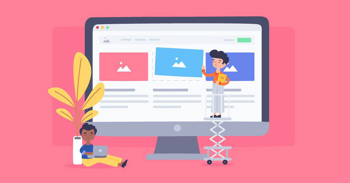
12 Basic Principles of an Amazing Website Design
A wide range of disciplines has contributed to developing website design fundamentals. Most of these rules may be bent to meet the needs of individual designers while still ensuring that the result is quality website designs. The impact of which features are included and how they are arranged.
User Interface (UI) and User Experience (UX) design is made simple by principles of good website design. Conversions are boosted when they are implemented appropriately. A website’s usability and perception may be improved by incorporating basic web design principles into the project, allowing you to make better choices for your users and your web design firm as a whole.
1. Hierarchy of the Visual
Visual hierarchy is the most important of the foundational concepts of the design guide for a website. What’s so critical about it? Let’s get down to the nitty-gritty!
The visual hierarchy should be applied to everything a user sees on a screen. 92.6 percent of consumers cite the visual dimension as the most important aspect in making a purchase decision.
When it comes to deciding whether or not they enjoy your website, users don’t need a lot of time on their hands. As a result, you must make an impression on them right away. You’ll benefit from the visual hierarchy as well.
Visual hierarchy encompasses all aspects of the optical system
Balance of design components: Scaling and proportions may be used to draw attention to the elements you want your audience to concentrate on.
Color of the components: The use of color is another effective method for attracting consumers’ attention. There are, of course, specific well-known psychological tactics, such as the use of red as a negative color and green as a cheerful color. Even yet, in terms of web design concepts and components, visual hierarchy relies on color combinations (monochromatic, complementary, analogous, triadic, tetradic colors). The Color Wheel can assist you in choosing the colors and hues you want to use.
Typography: There should always be a logical connection between the words used. In addition, the visual representation of these words on the computer might help them make even more sense. That’s a little confusing. Using typography as a website designing basics is a key component.
Space: Web pages are no longer crammed with banners, leaving little room for anything else. Designers nowadays like to provide more negative space around important design features. It is especially appreciated by users who want graphics that are more “airy.”
Repetition: If you’re designing a new website, keep in mind that it’s best to reuse rather than build new parts regarding the most crucial aspects, such as logos or service symbols.
2. Consistent Color Scheme
The use of color is critical when establishing a hierarchy of knowledge on the website and is an important principle of good website design. It’s essential that users can quickly scan a page to get a sense of what it’s about. One of the most difficult chores in the world is to maintain a consistent color palette. The hue that we prefer may not be enjoyed by everyone. Colors frequently come at a price. Check with others to see whether the color you chose is popular. Certain colors work well with specific writing, while others don’t, so it’s important to keep the overall design consistent. To achieve the best results, conduct a survey, test, and iterate.
Your website’s color palette should also be consistent. Don’t use a color scheme that’s a mix-and-match affair. Avoid using colors that are too dark or too light on your website. When required, use underlining to draw attention to critical points. A good rule of thumb is to utilize complementary colors wherever possible. Additionally, minimize the number of colors in your design as much as feasible.
Take a look at your Gmail page. It is the epitome of simplicity. The aim here is to keep things as simple as possible. The colors are all evenly distributed. It’s easy to see all of the information. Only by scrutinizing this can you answer what makes a good website design.
3. Adaptive Design
What percentage of your site’s visitors come from desktop computers. Analyze your data more thoroughly! As of now, there are more than 4.32 billion active mobile users on the globe.
Even whether the consumer is using a Windows desktop, the most recent version of Android, or an iPhone, your website must look fantastic. The site should appear great when viewed across various operating systems and mobile devices. The user experience must, of course, stay unaltered.
Focusing on responsive design and deploying sound web design principles is essential to be on the cutting edge of website development nowadays.
You must ensure that you’re focusing on the most important aspects of responsive design and following principles of good website design.
Layout: A website’s design is what the public sees. If the public don’t like what they know, they’ll probably quit your website. And we’re confident that wasn’t your aim.
Media: The layout should consider this while creating the graphics and videos.
Typography: Typography also plays a significant role in responsive design and its value for visual hierarchy.
4. Easy Navigation
Anyone may benefit from knowing their location and the best route for getting there. Even if we cannot do this in the actual world, we expect to achieve it while using a website.
When the directions aren’t clear, it’s hard to know where you are going. Customers should never feel this way about your business. Because of this, here is one of the good web design principles that answer the query of what makes a good website:
A sitemap is a nice idea; navigation bars are also useful, and dropdown menus are a good option. Aside from that, sidebars are also a great option. This includes even 404-pages, as long as the website’s navigation is evident and easy to find from any point on the site.
5. Keep it Simple
The golden principle of good website design is to keep things simple. Complicated things annoy everyone. The same holds true from the user’s perspective. The simple fact may summarize all website design fundamentals revolving around simplicity. The customers would appreciate a website with a clean and minimalistic style.
However, there are occasions when keeping things simple isn’t the most excellent option. If you adopt this method, you may violate the norm by using animation, motion design, vivid effects, electrifying colors, a variety of kinds, and even an absolute lack of immediately accessible navigation.
In this situation, it is critical to collaborate with an expert service that can assist you in conveying appropriate messages while also making the abundance more visually appealing.
6. Produce Meaningful Content
Regardless of how excellent your design is, relevant and meaningful content must always be accompanied. If you want to keep up with the times, you must periodically update your website’s design.
In Covid-19, enterprising enterprises began to incorporate our lives’ information and context into their designs. It was not long before new goods and communication methods with customers appeared.
When it comes to your design, it’s a good idea to vary things up at times. In this approach, your site will always be up to date and relevant to the context and meaning we now exist.
7. Typography and Readability
Our quest for beauty may end up costing us a lot of money. Even the best web designers are not immune to making mistakes that tarnish the reputation of their profession as a whole. They do this by using the same graphic representation for the headlines and the body copy.
Because of this, we obtain a muddled product. Customers are unable to concentrate their attention since they are bombarded with simple text. Is there anything I can do to make it better? If you follow these excellent web design principles suggestions, your content’s readability will improve!
- Using white space may preserve even the most intricate communication. Put it where it belongs.
- There should never be a problem with sizing. It should be in balance with the rest of the website’s layout.
- The use of visuals helps to bolster the argument. Use them how you see fit!
- Regardless of their appearance, buttons should always be considered buttons.
- When you have a clear CTA, everything starts to fall into place.
Consider typography as well. Whenever possible, choose typefaces that can be read by a wide range of computer operating systems. You may also ensure that the replacements are eye-catching to the reader.
8. Loading Speed
Using Google Page Speed Insights, you can see how long it takes your website to load.
The quicker it loads, the better. SEO will benefit, and consumers would like it as well. Everybody hates waiting even a few seconds for a page to load. Another aspect of website design fundamentals is to save your clients time and energy.
There is nothing to worry about if you notice that the loading speed takes a long time. If you use the Google tool, you will be given a list of suggestions on making changes to your website.
9. “F” Pattern design
You may have heard of the F-reading method of website design. F-shape scan: from the right-top corner to the left-bottom corner. Typically, this pattern was used by designers to enhance the legibility of the written content. Site designers always adhered to this design philosophy.
Sadly, with the passage of time, the F-pattern has become obsolete. The way of life has evolved. A zigzag scanning pattern is presently in use.
Today, to design and compose texts, you must keep in mind that the user’s eyes go from the right to the left and from top to bottom. As a result, items must be placed in such a manner that users may scan them while traveling in a zigzag pattern.
10. Communication
The basics of web design are the same, no matter how many examples we look at. Your customers deserve the greatest communication available online or offline. Communication goes beyond just text messages on a website or interacting with a customer service professional.
The place to begin communication is with the person who provided the first lead. For example, in the city centre, you may use a billboard or Facebook advertisements. Websites follow. There should be a consistent tone and writing style across the website. Facebook, LinkedIn, Twitter, and Instagram should all use the same style and tone of communication.
If you’re communicating by email or text, be sure to use the same strategy. Everyone on your staff should be aware of the rules and norms for interacting with customers.
11. Friendly UI
The user interface is important. User interface (UI) is the visual representation of a website’s interface when it is first opened. Following the first encounter, you will determine whether or not you feel at ease.
If your photographs aren’t driving visitors to do the desired action, then they’re merely pretty pictures. As a result, gorgeous images might be distracting or even lead to unanticipated outcomes.
Here’s how things stand right now. You notice headphones on the webpage when you arrive. You may read about them, see videos of them in action, or even put them to the test using some of the most cutting-edge artificial intelligence (AI) tools. You’re ready to purchase them now that you’re completely pleased. The button is nowhere to be seen, though.
In addition, you search for the headphones’ model number online to purchase them elsewhere. The user interface looked great, but it was uncomfortable to use. You didn’t want to spend your time looking for the button.
Every firm can face these kinds of issues. UX and UI should never be separated. Even the most gorgeous website will be useless if this is not the case.
12. Feedback on progress
Providing feedback is a way to gauge how well an activity, procedure, or event went or how well it might have been done. In this scenario, find out what’s going on within the system or website. Think about an online transaction when you’re not sure what’s going on in the process at all at one particular moment in time. You get a notification that a transaction has failed. You have no idea what you’re doing at this stage.
When a transaction fails, the website should explain what went wrong, such as an internet connection problem, an overdrawn bank account, or even a minor technical fault with the website. The feedback regarding progress is a crucial part of the design, and it is also the initial usability heuristic of user-interface design.
Important Resources:
- Benefits of Website Development
- How to Choose Website Development Agency?
- React JS Development
- How to Hire Custom UI Developer in Pakistan?
- Best Web Design Agency in Lahore
- Website Development Cost in Pakistan
UMW MEDIA Is a leading design and development agency in Pakistan offering number of services to businesss across the country.
To illustrate what is meant by “feedback on progress,” consider the example presented below.
Allow me to illustrate this by supposing that you can track the status of a photo while it’s being posted to Gmail as an attachment. These little adjustments improve the usability of your website. It is important to illustrate progress by using suitable loads or percentages.
Inform the user if an item or a product is unavailable for purchasing. Users will know whether they’re on the proper path if a success or failure screen is shown.